Monday, June 25, 2007


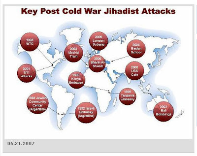
This map caught my eye yesterday. Looking through the big red blobs (which are nicely transparent and gradient shaded) the map of the world looks really nice. The image is clean and clear without being heavy handed. In this age of satellite images and elevation data for the world all easily available, it's different to see a map that is defined by what is missing, namely color. The blue faded buffer around the continents would be fairly easy to pull off in ArcMap. The trick would be either starting with a not very detailed layer of the continents, or generalizing the resulting buffer to give it that nice rounded look. It looks like it's not a true 'buffer' either, because the buffer of the tips of South America and Africa are definitely thinner than the buffer around their edges. Since I live on the west coast and the majority of my maps have the ocean in them, I might try this. I've often looked at the solid blue mass on my maps and wondered how to make it better. I thought the watercolor effect would be great for variety, but since it still eludes me, I may try this.

Map via Mitt Romney's web site via Presentation Zen.
Tuesday, June 12, 2007

For inspiration, go here...


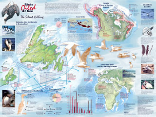
Wow. I just found the Cartography and Geographic Information Society's Map Design Competition winner's page. If you need a little inspiration before starting your next map, check these out!

Image: Birds Oiled at Sea: The Silent Killing by Fiona Harriss

Historical Mapping


Oooh. Looking forward to reading about this technique on how to achieve the look of historical maps!

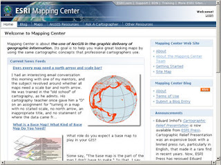
ESRI Mapping Center


A friend that is part of the Master's program at the University of Redlands pointed me in the direction of a little known ESRI web site called the Mapping Center. It's run by a former classmate of mine from Oregon State University, Aileen Buckley. The website has a blog and features some cool tips about ArcMap and Cartography. I saw Aileen give a presentation at the ESRI User Conference in 2005 and it was chock full of wonderful cartography tips.

So far the Mapping Center only has a few posts, but I'm looking forward to more great things to come from this page. I recommend bookmarking it!

While you are there check out the "ArcGIS Resources" tab for downloadable styles and toolboxes, including the Swiss Hillshade Toolbox that I saw Aileen demonstrate at the 2005 ESRI User Conference.