Monday, October 15, 2007
Strange Maps
While browsing PC Mags "Our Favorite 100 Blogs" list I found this blog devoted to strange maps. Strange indeed.
Guest blogger - Matt Kenny
Our guest blogger Matt Kenny created this beautiful map for his cartography class at Western Washington University. Here are his comments about creating the map:
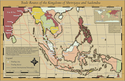
Image used with permission

Image used with permission
"This map was submitted as my final project for a cartography class at Western Washington University. I knew that I wanted to create a historical-style map, something similar to a treasure map. With the help of Huxley College's Map Librarian, Janet Collins, I was able to find a National Geographic map with the trade routes depicted in the final project. A line shapefile was created and the routes were then digitized on-screen using the map as a reference.
Symbology throughout the project was rather simple, as our professor had given us a clean dataset to work with from the beginning. For example, the border shapefile was distributed with a 'bnd_type' attribute which differentiated coastline from an international boundary. This allowed us to focus on pure cartography rather than grappling with data management issues.
One of the most interesting challenges in the project was how to add a sense of depth and visual separation between the countries and the ocean. Placing a lat/long grid between the ocean and country layers helped, but the countries still were not standing out. I was given a coastline multiple ring buffer layer, where I symbolized each ring with a progressively lighter shade of brown, until it matched the ocean color itself. I really recommend this trick when the feel of bathymetric data is required for purely cartographic purposes. Strong serif fonts such as Monotype Corsiva aided in the old-world look. Overall design time was around nine hours."
Monday, June 25, 2007

This map caught my eye yesterday. Looking through the big red blobs (which are nicely transparent and gradient shaded) the map of the world looks really nice. The image is clean and clear without being heavy handed. In this age of satellite images and elevation data for the world all easily available, it's different to see a map that is defined by what is missing, namely color. The blue faded buffer around the continents would be fairly easy to pull off in ArcMap. The trick would be either starting with a not very detailed layer of the continents, or generalizing the resulting buffer to give it that nice rounded look. It looks like it's not a true 'buffer' either, because the buffer of the tips of South America and Africa are definitely thinner than the buffer around their edges. Since I live on the west coast and the majority of my maps have the ocean in them, I might try this. I've often looked at the solid blue mass on my maps and wondered how to make it better. I thought the watercolor effect would be great for variety, but since it still eludes me, I may try this.
Map via Mitt Romney's web site via Presentation Zen.
Tuesday, June 12, 2007
For inspiration, go here...

Wow. I just found the Cartography and Geographic Information Society's Map Design Competition winner's page. If you need a little inspiration before starting your next map, check these out!
Image: Birds Oiled at Sea: The Silent Killing by Fiona Harriss
Historical Mapping

Oooh. Looking forward to reading about this technique on how to achieve the look of historical maps!
ESRI Mapping Center

A friend that is part of the Master's program at the University of Redlands pointed me in the direction of a little known ESRI web site called the Mapping Center. It's run by a former classmate of mine from Oregon State University, Aileen Buckley. The website has a blog and features some cool tips about ArcMap and Cartography. I saw Aileen give a presentation at the ESRI User Conference in 2005 and it was chock full of wonderful cartography tips.
So far the Mapping Center only has a few posts, but I'm looking forward to more great things to come from this page. I recommend bookmarking it!
While you are there check out the "ArcGIS Resources" tab for downloadable styles and toolboxes, including the Swiss Hillshade Toolbox that I saw Aileen demonstrate at the 2005 ESRI User Conference.
Wednesday, May 23, 2007
Canoe Journey

Finally! I finished the canoe journey map! I don't usually get time at work to make a map beautiful, but I did on this one and I really like how it turned out. Finding the Canadian data took a while but I did find a place to download the DEMs for free. It just took a loooong time to get them.
Subscribe to:
Posts (Atom)

