Monday, October 15, 2007
Strange Maps
While browsing PC Mags "Our Favorite 100 Blogs" list I found this blog devoted to strange maps. Strange indeed.
Guest blogger - Matt Kenny
Our guest blogger Matt Kenny created this beautiful map for his cartography class at Western Washington University. Here are his comments about creating the map:
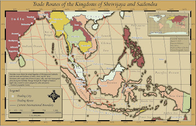
Image used with permission

Image used with permission
"This map was submitted as my final project for a cartography class at Western Washington University. I knew that I wanted to create a historical-style map, something similar to a treasure map. With the help of Huxley College's Map Librarian, Janet Collins, I was able to find a National Geographic map with the trade routes depicted in the final project. A line shapefile was created and the routes were then digitized on-screen using the map as a reference.
Symbology throughout the project was rather simple, as our professor had given us a clean dataset to work with from the beginning. For example, the border shapefile was distributed with a 'bnd_type' attribute which differentiated coastline from an international boundary. This allowed us to focus on pure cartography rather than grappling with data management issues.
One of the most interesting challenges in the project was how to add a sense of depth and visual separation between the countries and the ocean. Placing a lat/long grid between the ocean and country layers helped, but the countries still were not standing out. I was given a coastline multiple ring buffer layer, where I symbolized each ring with a progressively lighter shade of brown, until it matched the ocean color itself. I really recommend this trick when the feel of bathymetric data is required for purely cartographic purposes. Strong serif fonts such as Monotype Corsiva aided in the old-world look. Overall design time was around nine hours."
Subscribe to:
Posts (Atom)

